Learn with our products
Traders Action Zone has four stages, each one dictates how a stock should be traded.
Traders Action Zone or TAZ contains the simple truth to all stock market trading and lies in the figure below (Fig. 1), whether it is a broad market index or a single security. Understanding which stage you are in dictates how it should be traded. This pattern holds true because it is the nature, the heartbeat of market action. It also holds in all time frames, that is the Traders Action Zone or TAZ, applies, be it monthly, weekly, daily or intraday charts.
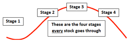
Fig. 1
Four Market Stages: Stage 1 occurs after a long downtrend. The stock has been going down but is now beginning to form a base trading sideways, moving it into stage 2 of the Traders Action Zone or TAZ, the glory stage where traders make most of the money made in the market.
Stage 2 is where the smart money gets into the stock, ahead of those traders who aren’t convinced of the value yet. This is where the Japanese proverb relates: “Climbing the ladder of success is not accomplished with your hands in your pockets.” Do not wait and buy high!
Stage 3 is called the “churning” stage, where low-information traders are just now getting into positions. Buyers and sellers are now in a balance and the stock drifts, awaiting the next stage.
Stage 4 finds the nasty downtrend for those still in their positions. And the interesting twist to this stage is most low-information traders don’t believe the stock will go down and hang-on to see greater losses. The result of this four-stage market pattern is buy high, sell low! Savvy traders who understand the stages of TAZ, literally pick the pockets of the novice. See how a candle pattern can help us follow the action…
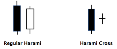
Fig. 2
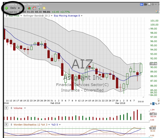
Traders Action Zone:
As Swing traders, we are looking for stocks that have pulled back into the Traders Action Zone, then find a reversal signal like that shown at the four white arrows on Fig. 3. Notice the two-candle patterns shown at each turning point, White Arrow. This Candlestick is called a Harami and is composed of a two-candle formation in a down-trending market (see Fig. 2). When used to forecast a reversal to the up-side, the colors for the Harami are Black then White (closed then open, on the green). The message of a Harami is the selling-has-stopped!
Fig. 3
When a long black candle in a downtrend is followed by a shorter white candle, the odds are that the downtrend is coming to an end. Look carefully at the turning points shown at the white arrows in Fig. 3 above. Points 1, 2 and 3 confirm that notion, but the last arrow ran into a down-Gap. An alert trader would have sensed a problem with two down-ticks before the gap. Larry Williams, the legendary trader and author, says how he admires ballerinas; “…they are always on their toes!” What we’re talking about for our trading ammunition are Reversals! Where does the existing trend change direction? Is it a single candle event or are there patterns that suggest a change is coming? The following charts are examples of Harami signals dealing with those questions. Remember: the solid green indicates the price closed lower than it opened. The open candle indicates that the price closed higher at the end of the day. See how this is played out in Fig. 4.
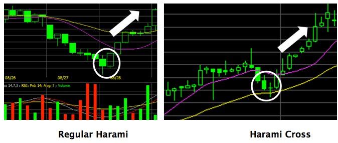
Fig. 4
The Harami can signal the top of a trend, as well as reversals on the way down. Figure 5 is an example of the reverse Harami where the signal is the end of an up-trend. The white then black combination suggests buying is stalling and may be a good place for a short. We cover how traders can short the market in Section 6 in our new book, “Provident Investing.”
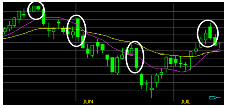
Fig. 5
Look at the following two charts, Figs. 6 and 7. Find points where a candle pattern might suggest a good place to enter a trade.
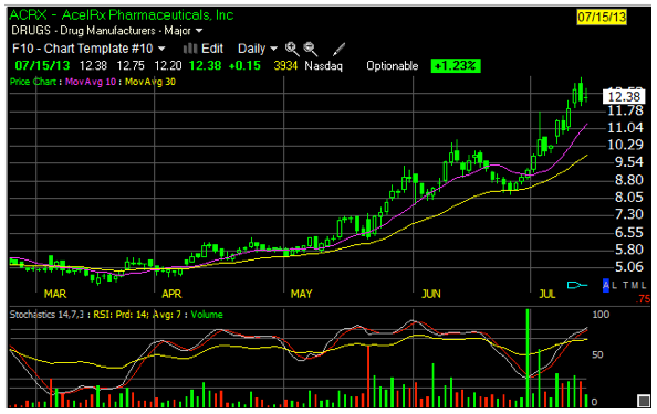
Fig. 6