A – TC2000 Technical Indicators:
Time Segmented Volume (TSV)
1. The Worden Brothers (TC2000 owners) call this “…a proprietary technical indicator calculated from both a security’s price and volume. Various time segments of both price and volume are compared to one another in order to uncover periods of accumulation (buying) and distribution (selling).” That doesn’t tell us much about the way it is calculated but its purpose is clear. That is essentially the same message for other price/volume oscillators.
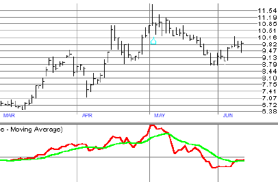
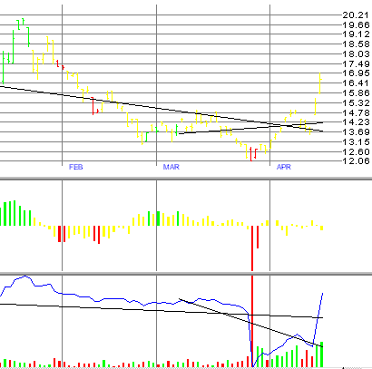
2. Look at the chart below for a TSV example (Fig. 1). This price chart for PAP shows how the TSV (the red line) basically follows the price movement, with corresponding highs March through May. The TSV is calculated in this example with an 18-day period (chosen in the Indicator window for Time Segmented Volume). Worden says this parameter is arbitrary but that its most typical use is with 18-, 26-, or 31-bar periods. We prefer the 18-bar period which is most useful with short-term rolling stocks.
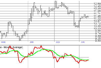
4. In the previous chart (Fig. 2), buying pressure is evident for almost three months. There is no divergence between the TSV and Price bars. This is what we would expect. A contrary view is shown on the following chart.
6. Four things to consider as we interpret a TSV pattern:
- Are there positive or negative divergences between price and TSV? For instance, if price increases above a previous peak and the TSV line does not, we have a negative divergence. The price will eventually pull back. The opposite is true with a positive divergence.
- What is the position of the TSV line relative to zero? Above the line: positive buying pressure. Below the line: negative selling pressure.
- What is the position of the MA relative to the zero line?
- How does the TSV behave relative to the MA? Does it remain above or below the MA for any significant period of time?
7. The message these four factors provide can be improved by looking at how the TSV has behaved on the same or similar stocks previously. If it has been reliable in the past, it will likely work in the future. If not….
8. We find TSV a reliable indicator for the segment of the market we play in.
Balance of Power (BOP)
1. The Worden description of this indicator is exactly the same as for the TSV. Not much detail but the purpose is again clear.
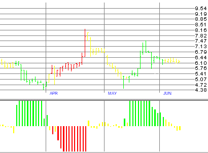
2. BOP is plotted in the middle window below as a series of bars above and below a center line plotted in color, green above the line (buying), red below (selling), and yellow (no dominant action). Volume bars are included in the bottom window below. For convenience the price bars are plotted in the same color as the BOP bars. This makes it easy to see changes in the character of the price action. Note: Although the BOP is plotted above and below the zero line, it is not an oscillator, moving up and down with price. The chart below is a snapshot of the price action on Iomega (IOM). Look at the color scheme and the message it sends.
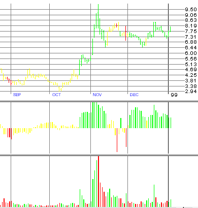
3. In this chart (Fig. 3) we see a change in character taking place the last week in October where considerable systematic buying takes place. This is the key! The volume bars are shown in the bottom window to help us understand the action. What does “systematic buying” mean? It does not mean there are more buyers than sellers. That phrase is an oxymoron. For every market transaction, there must be a buyer for every sale. The “systematic” nature refers to the prevailing attitude, primarily among institutional forces (smart money) moving large blocks of orders in and out of the market. The principles of supply & demand then respond with price changes, as buyers and sellers agree on the terms. In our chart above on Iomega, we can sense the change in attitude in late October (cause), then see the result with the price peak (effect) in early November.
4. Notice the color scheme on the volume bars is not the same as BOP. A green volume bar means the price increased that day, red means the price went down.
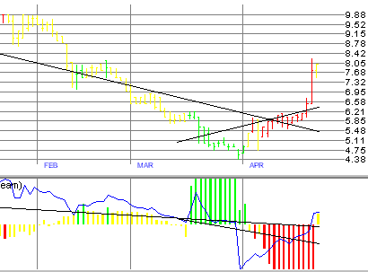
5. Looking at Fig. 4 (SCBI) below, we see an important value in the BOP is its ability to contradict price movements. We see two direct contradictions in the chart below, the last half of March & the first half of April. This demonstrates the independence of BOP, with the ability to contradict beyond that of other technical indicators we’ve studied.
6. In summary, BOP helps us understand the “quality” of a trend. It does not signal buy and sell triggers but reveals hidden patterns of accumulation (buying) and distribution (selling). It does this very reliably. We will see that a pattern of distribution does not always lead to a fall in prices, or that accumulation always precedes a rise. It tells us what “smart” money is doing. Smart money is not always right, but we disregard these signals at our own peril. For example, if we see systematic selling with price moving to new highs, watch out! BOP finds an important place in the Provident Investor’s toolbox.
Cumulative Money Stream (CMS)
1. This third proprietary indicator provided by TC2000 is a price/volume indicator, similar to On Balance Volume (OBV). It is used much like OBV, looking for divergences with the price pattern.
2. Fig. 5 below adds the CMS line to the previous chart on SCBI shifted time. This shows the price line up to the point in April where the previous chart shows the price turning down. We already saw the BOP very Red this first part of April. The money stream (CMS) is the Blue line laid over the BOP frame.
3. It looks like the CMS pretty much follows the price line, but a very useful feature with regression lines helps us spot divergences. The black lines on Price and CMS are regression lines, pretty much averages of the time included. The longer lines are 100 bars (days) and the shorter lines are 30 bars. The key is the slope of these lines. If the CMS follows price exactly, the lines will be parallel. We don’t care which direction they are sloping, but are they sloping at the same angles? We will focus on the shorter lines. Notice the regression line on the CMS is on a quite different slope than the Price regression line. This shows the a divergence with CMS confirming the BOP message. We are able to see this confirmation by just eye-balling the chart.
4. The following price chart (Fig. 6) on another recent pick illustrates several points for consideration. First, there is no systematic buying or selling, with neutral (yellow) BOP. The last thirty days of the chart (that time represented by the shorter black regression lines) show a divergence between price and CMS. However, the last two days of the chart show a marked increase in the CMS, which the 30 day regression (average line) has not yet caught up with. This may warrant careful attention to see if an uptick materializes.
Fig. 6 KEP Price Chart with CMS
5. CMS used in conjunction with BOP is a great combination. They do not always agree but the message is doubly strong when they do. CMS is another important tool in the Provident Investor’s toolbox.
B – Indicator Management on TC2000:
This exercise walks us through a new Indicator setup, using our default setup conditions on three separate Tabs:
Setting up indicators on TC2000:
Tab A:
1. Select a tab number at the top of the TC2000 screen which is not in use, for example, Tab 10.
2. Totally erase all indicators and price lines on all three windows:
- Press the letter I (or click on the large Bold I icon).
- This will bring us to “Editing Indicator Tab #10.”
- One by one, click on each line of the window and press “Remove Indicator.” (It will not allow us to remove the price bar chart from the top window)
- Press Refresh, and Close. We’re left with a clean screen with only the Price-bar chart in the top window.
- We can modify this chart by going back to I, then select a different Type of Price Graph if we choose, or change the color of the chart.
3. Click on I: Click on Bottom: Add Indicator: Select Volume Bars on pull down menu: OK: (Use the default colors, Green Rising and Red Falling, & be sure the Visible box is checked) Refresh: Close!
4. Click on I: Click on Bottom: Add Indicator: Select Money Stream (at the very bottom of the pull down menu): OK: Select colors of your choice (we use Yellow for Money Stream and White for Regression): Be sure both boxes are checked (Apply Regression… & Visible): Refresh: Close!
5. Click on I: Middle: Add Indicator: Stochastics: OK: There are three periods to select for the Stochastics – Our choice is “Period=14,” “SK Period=9,” “SD Period=7.” We use Red for SK, Cyan for SD, Normal drawing style, and Simple Moving Average Calculation: Refresh: Close!
6. Click on I: Middle: Add Indicator: Balance of Power: OK: (Use default colors, Green High, Yellow Mid, Red Low): Be sure both boxes are checked (Apply BOP…, & Visible): Refresh: Close!
7. Click on I: Middle: Add Indicator: Time Segmented Volume: “Period = 14,” “Color = Yellow,” “Visible,” “Drawing Style = Normal,” “Moving Average Calculation = Simple”: Refresh: Close!
8. Click on I: Top: Add Indicator: Wilder’s RSI: OK: “RSI Period = 10,” “Avg. Period = 5,” “Drawing Color = Red,” “Visible checked,” “Drawing Style = Wide,” “Moving Average Calculation = Simple.”: Refresh: Close!
9. Click on I: Top: Add Indicator: On Balance Volume: OK: “Drawing Color = Blue,” “Visible checked,” “Drawing Style = Wide.”: Refresh: Close!
10. This represents our Tab A default setup. It may seem cluttered, but with a single screen we can:
- Look at the price pattern in the top window (Clue 1).
- Look at the volume bars relative to the price pattern (Clue 2).
- Confirm volume action by checking the OBV in the top window (Clue 3).
- Check the underlying strength of the price trend two ways; with BOP in the middle window and the Money Stream in the bottom. Notice how convenient it is to compare the two 30-day (short) regression lines, Price in the top and MS in the bottom. Parallel lines tell us the money stream supports the trend. This will usually be the case. MS will simply follow the price. However, a divergence can be a very important signal for forthcoming price action (Clues 4, 5, …).
- Check the Overbought/Oversold condition two ways; RSI in the top window or Stochastics in the middle window (More clues).
11. Once the indicators are setup, we can select any ticker by pressing J (or clicking on the large Bold J icon) and typing in the Ticker. We can zoom out or in with the Magnifier Icons. We find ourselves spending more time on Zoom = 5.
12. Here is a magnificent tip: A good way to check any trend, be it Price, OBV, TVS, CMS, etc., is to see how it looks on a weekly chart. That is, when a trend is evident on a weekly as well as a daily chart, that is a good confirmation. Try this: Look at a chart on the TC-2000 screen. In the top-right portion of the screen you should see “daily.” There is also a pull down menu in the top center next to the “I” icon. Very simply, we are looking at daily chart with each entry representing a single day. Rather than use the pull-down menu, press the number “5” and watch the screen change to “weekly.” In fact, any number you press will change the chart time frame, 2-day, 3-day, etc. This is a quick and easy way to learn more about the technical characteristics of a stock.
13. For instance, we can use a weekly stochastics chart as a trend filter on a daily stochastics chart. That is, we can use the weekly chart to tell us the larger market trend and see if it supports our daily activity.
14. Always check the time frame when looking at a chart. That is, you may miss some action if you are on a weekly chart and think it is daily.
Tab B:
- Tab A gave us our first pass screen for a ticker. Most of the time this as far as we will get, seeing no promise in a particular stock at this time. If there is promise, we study the next two screens.
- Select a tab number at the top of the TC2000 screen which is not in use, say Tab 11.
- Erase all indicators on the three windows leaving only the price line.
- We haven’t used any moving averages yet, to keep the first screen uncluttered. In this screen we will put a moving average on TSV, a very important clue-digger combination.
- Click on I: Click on Middle: Add Indicator: Select Time Segmented Volume on pull down menu: OK: Refresh: Close!
Tab C:
- Select another unused tab number at the top of the TC2000 screen.
- Follow previous steps to have a clean price chart, then add Bollinger Bands as an aid to setting buy and sell points.
- You can do that without help now.
C – Rate of Change (ROC)
1. Earlier we discussed momentum as a measure of how fast changes occur. We saw the value of oscillators (RSI, Stochastics, MACD) in gauging momentum. This helps us understand the likelihood of a continued trend or a trend reversal. There is another helpful oscillator called the Rate of Change (ROC) that can be used to measure the momentum of any series, price or even other oscillators. The ROC compares the difference between a current value (for instance, Price) and the value at some previous time. We can go into the indicator management tool on TC-2000 and attach this ROC to other indicators, looking for changes in momentum.
2. Item 12 in the previous section illustrated the value in comparing an indicator in different time frames. Time frames are critical in our trading efforts and generally vary between one of three choices: Short, intermediate, and long. There is no one time span to fit all occasions. We prefer a short-term focus for our work with rolling stocks, although others have profited from a more conservative perspective; rolling stocks in monthly time frames instead of weekly. The three general choices are:
- Short; three to six weeks typically, but as short as five days and as long as 45 days.
- Intermediate; three weeks to as long as six months.
- Long; anything above six months, with particular attention focused on 9 month, 12 month, and 48 month periods. As we analyze price patterns we can benefit by comparing the same indicators in different time spans. Within each of the three general time spans noted here, we can choose different sub-frames for comparison. With the ROC, this approach can be helpful as shown below.
3. While we look for signs of reversal, some time frames may work better than others which makes it even more important to monitor different time spans together. For instance, looking at only one time span may miss a key element. Thinking about our time-worn maxim, if one time span monitor signals a reversal, the odds jump way up if two time spans say the same thing. If a third time span confirms the other two signals, our odds of identifying the reversal are greater still. Follow this next step for a good example.
4. To set up the ROC indicator on TC2000, Bring up TC2000:
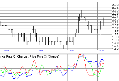
1. Select a pick, e.g. Sizzler (Fig. 7), by pressing the J key and typing in SZ, then hit enter.
2. Let’s start with the same picture by taking the following steps:
- On the top of the main window there are 12 tabs. Click on #12 so this tutorial will not affect any of the rest of your TC2000 setup. (this assumes you are not using tab 12. If you are, choose an unused tab for this exercise)
- Press the I key to bring up the indicator window
- In the top window, highlight “Prices – Open Bar Chart.” Under drawing color, select White.
- Highlight any other indicators shown in the Top window and press Remove Indicator. We want only the white price bars in the top window for this illustration.
- In the same way, remove all other indicators in the Middle and Bottom windows.
- Now click on the Middle row and press Add Indicator. Select Price Rate of Change on the scroll down window and press OK.
- Select a Period of 5 with a drawing color Red, press Refresh and Close.
- Click on Middle again and repeat the last two steps with a Period of 10 and Color Green. Refresh & Close.
- Repeat the previous step for a Period of 20 and Color Blue, Refresh & Close.
3. Next, click the + or – magnifying icons to get to the Zoom = 6 position. We should now be looking at the same picture.
4. The Price Rate of Change indicator is an oscillator signaling over-bought conditions at the top and over-sold conditions at the bottom. The purpose of this exercise is to show the value in looking at more than one ROC time span. Notice the concurrence of all three ROC indicators the middle of May. What are the odds that this represents a true overbought condition ready for a downward correction? How strong is this signal compared to the earlier one the last week in March?
5. Now consider the price turn at the end of May. Do the ROC lines signal an oversold condition, ready for a turn up? The five and ten period signals do, but the 20 period has not yet caught up. This ROC indicator works well as an OB/OS signal, but the problem is there are no pat rules about where the OB & OS lines should be drawn. This requires judgement on our part. Since hindsight is 20-20, it may have been a good move to buy at this point. Or, it may tumble to a more favorable buy position later in June. Watch this carefully. In any case, the more indicators we can bring into play for comparison, the better our odds for success.
6. A note on indicator usage: All of the indicators we have studied contribute greatly to our understanding of what is going on with stock prices in our portfolios. However, none of the indicators singly will tell us with precision when to buy and when to sell. Each indicator will fail us at some time, moving irrationally (in a manner contrary to what we hoped for). It is by gathering consensus from many comparisons that we are in a position to exercise good judgement. And yes, it means taking risks, which is what the market pays us for. If we wait to see what the right decision would have been, we would have made some money… It must be a continued effort on our part to reduce (but never eliminate) the risks by educating ourselves. That is what education is in any arena, risk-reduction!
D – Technical Analysis Summary
This represent one opinion, the Provident Investor, based on a study of the segment of the market we have chosen to deal with. That is, Swing trading, including rolling stocks, with a short-term traders hat on. We’ve chosen this arena because of the merits of the activity and the ability to see chips fly. We cover other important indicators in our book. We avoid getting so much information that we confuse ourselves trying to figure out what is important.
- Note: The Rate of Change (ROC) is not a proprietary TC-2000 indicator. Many other TI’s are available to help us get into and out of positions ahead of the crowd. When Worden’s TC-2000 indicators are properly used in concert with other indicators shown on the Master Overbought/Oversold Indicator Summary in chapter 5 of “Provident Investing,” you have real power! But wait! can we use too many indicators? See the “Trader’s Doom” also in chapter 5!
- We hope this series on technical analysis will help each of you find a new understanding of what it takes for success in the market and the confidence to take action. There are no certainties, no magic bullet or scheme or system that will allow us to escape the risks of the market place. All any of us will ever have are educated guesses about what a stock will do next. It is the level of that “educated” guess we are trying to improve, increasing the probability of success.
- In the real world we can’t know with certainty what direction a stock will go, but we must have an opinion, a hypothesis, for only in trying and in having success or in making a mistake will we ever learn life’s (or the market’s) lessons. It has been said that trying doesn’t increase the risk, it reduces it. May we find joy in our efforts.
- Be diligent, take action…
“In God we trust, all else must bring data!”
TC2000, EasyScan, MoneyStream, Time Segmented Volume, TSV, Balance of Power, BOP are registered trademarks or trademarks of Worden Brothers, Inc.
In a word – INSIGHT!

